
CSS container queries are here!
Published | Blog post
It’s a good time to be a web developer. The excesses of client-side mania (mea culpa) are giving way to a rediscovery of server-side rendering (which of course never went anywhere). Build-and-deploy services like Vercel, Amplify, Azure Static Web Apps, and a host of others make it easy for small teams or one lone freelancer to set up fully featured websites with edge functions, caching, APIs, and smart image delivery. And with recent advances, especially in CSS, working on the front of the front end is full of new possibilities and productivity gains.
CSS, it turns out, really is awesome.
Container queries, finally!
One of the features I and others have been most eagerly awaiting is container queries. They will make reusing responsive components in different contexts much easier. Grid and flexbox layouts have already lessened the need to use media queries to make layouts responsive to screen size. They are intrinsically responsive, wrapping rows and columns based on container size without the need to instruct browsers at exactly what screen width to make the change.
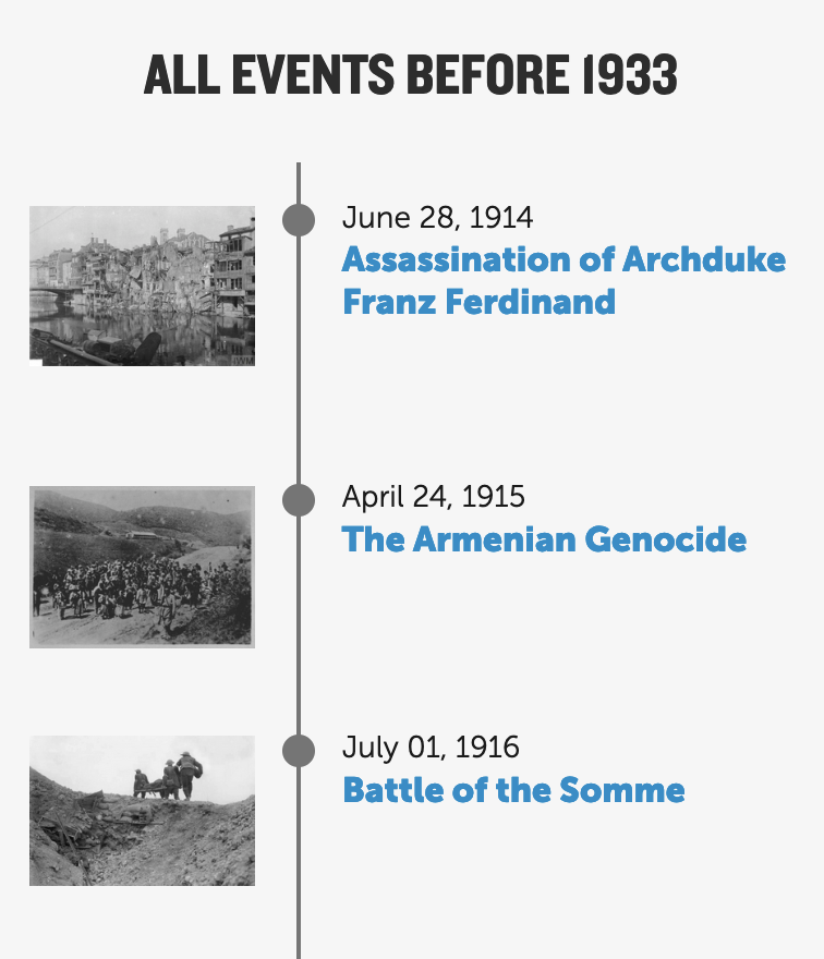
That’s great, but they haven’t entirely eliminated my use of media queries. There is still a need to employ them to, for instance, hide an element within a grid at certain screen sizes. Here’s a recent example from my work rebuilding the timeline-of-events pages for the Holocaust Encyclopedia.
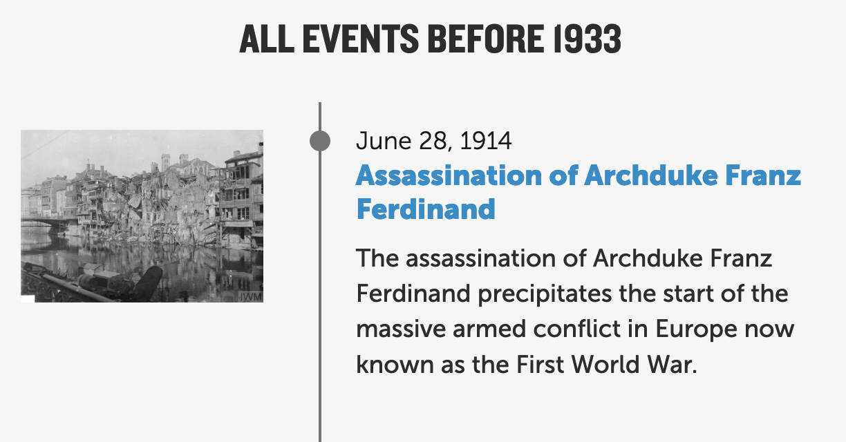
This is the HTML for one of the content cards, each marked up as an <article>:
Embedded content: https://gist.github.com/ostermanj/b7b7b55bfb8483e4599dbf82f8690632
The CSS makes each event a flexbox with two flex-item children: the container for the image and the container for the text. The relative size of the two children is handled intrinsically using the flex-grow css property—no need for media queries there. But we wanted to show the description of the event only on screens larger than 500px wide, and that required a media query:
Embedded content: https://gist.github.com/ostermanj/48a62a2cceebab82992e8fb8ce5b3703
What that means, though, is that the list of events isn’t 100% reusable in other contexts. Say I needed to put the list of events in a sidebar that was 320px wide? If the viewport were at least 500px wide, the event description would show even though the component would be much narrower than the threshold. The logic should be based on the size of the component, not the size of the screen. That’s what container queries make possible.
Simple syntax
The syntax is pretty simple and builds what we already know from media queries. See the MDN article for a full description.
Changing my example to use container queries would only require changing to CSS to declare a containment context on the article element, giving it a container-type and container-name using the container shorthand syntax:
Embedded content: https://gist.github.com/ostermanj/d948427303b301a896bf153b30c934f5
And then modify the media query from above to be a container query instead:
Embedded content: https://gist.github.com/ostermanj/1fca89adfbd045bb9a9e948b3b157293
Pretty great! Now displaying or hiding the description depends on the size of the container rather than the viewport. That means the component can be used elsewhere without having to redefine at what screen sizes the description should appear. Code it once and use it everywhere.
Use them now?
I’ll be using container queries from here on out in personal projects soon, I hope, in work projects for production.
Container queries are landing in browsers and, at the time I’m writing this, have about 75% browser support globally. Firefox, notably, does not yet support them in the stable release but does in the nightly release. Coverage should be good enough now or very soon to use them in a progressive-enhancement sort of way, when you can accept that some browsers won’t abide.
There is a JavaScript polyfill available that simply works. Please read its docs before using.