

Energy use intensity of multifamily dwellings: map and data visualization
What began as a request for some data viz help from a former colleague turned into a full-fledged web app for multiple clients.
Published
What began as a request for some data viz help from a former colleague turned into a full-fledged web app for multiple clients.
Published
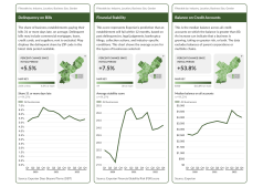
This project to chart Philadelphia's economic recovery was one of my last while at Pew, and one of the hardest.
Published

There are off-the-shelf charting solutions not too different from this but none cross the print-web divide as well.
Published

This data viz illustrates commercial tuna catch and value from 2012 to 2018 compiled by Pew researchers.
Published

Charts and maps documenting the health of Pennsylvania's retirement savings.
Published

Analyze data from 10 U.S. cities on key economic, social, and demographic indicators over the past decade.
Published
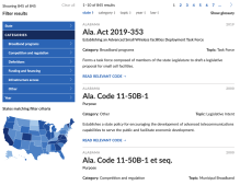
Explore broadband programs, competition and regulation, definitions, funding and financing, and infrastructure access.
Published

An art-directed digital-first report with animated graphs and immersive imagery.
Published

Compare debt levels across tailored peer groups, including comparing states with similar borrowing practices, constraints, and needs.
Published

This map plots 93,541 flood policies and characterizes them as either high- or low-deductible plans.
Published