
Energy use intensity of multifamily dwellings: map and data visualization
Published | Project
I’ve worked on this project off and on as an independent contractor since early 2020. What began as a request for some data viz help from a former colleague turned into a full-fledged web app for multiple clients. It’s pushed me into the full-stack realm of multifactor user authentication, client-specific feature flags, AWS Lambdas and APIs, and Elastic Search, all while maintaining the front end and making design decisions.
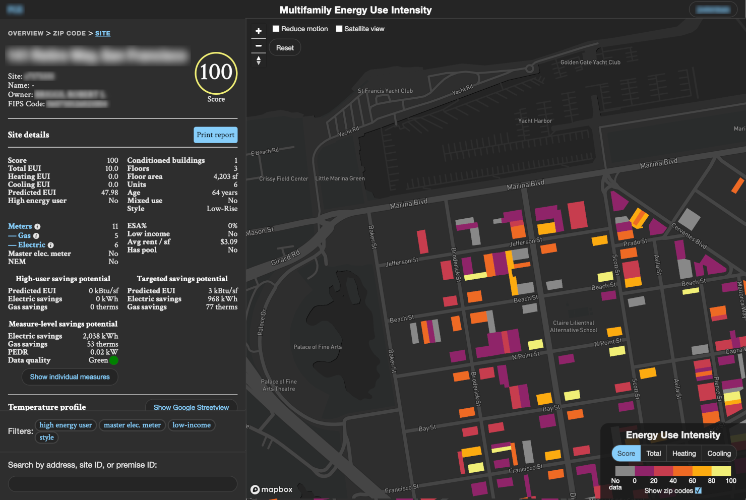
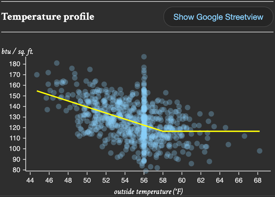
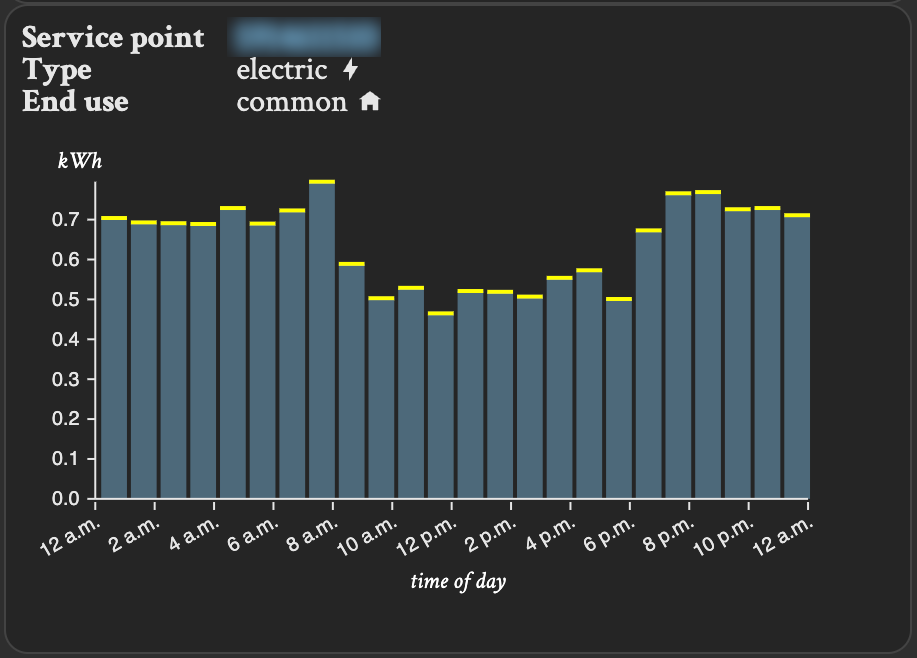
The work is for Res-Intel, which engages in mass-scale benchmarking of residential buildings’ energy use for energy companies to lower costs and for municipalities to meet energy-efficiency and climate-change goals. The data scientists use sophisticated methods I don’t fully understand to rate a property’s actual energy use against what it could or should be and show which interventions would most reduce energy use. This, repeated, for several tens of thousands of sites in a particular area.
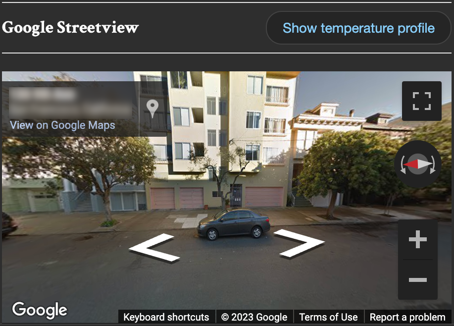
At first my job was to visualize some of this data on an interactive map. I reached for Mapbox to get that started. It grew quickly to require fetching dynamic data from an AWS PostgreSQL database, then multiple user groups each with different data and features to access, then SMS multifactor authentication, then a high-performing search of sites by ID or address, then filters to restrict searches to certain criteria, then an option to have a print output of a selected site’s data.
Since launching the first dashboard my work has been to add data and features for additional clients and to update the data when needed. That latter process involves running the raw data I receive from colleagues through some preprocessing Node scripts. With some of that output I manually update the part of the data embedded in Mapbox tiles; a future improvement would use Mapbox’s tiling service to make those updates easier. Updating the documents in Elastic Search is done with Node scripts hitting the Elastic APIs. Updates have been smooth, though time consuming— there’s room for more automation there.
As with any project that grows organically, one unforeseen piece at a time, the maintenance and design solutions have been challenging. But with some good decisions made at the outset, a complete refactor has not been necessary. Future improvements on the to-do list (or wishlist?) include more Typescript, full Dockerizing of the application, and more consolidation of the disparate parts.