
Four questions to ask about your data visualization
Published | Blog post
If charts and data visualizations are part of your content strategy, you know there’s a ton of advice out there about how to do them well. At the very least, you should ask yourself four questions about “the AIMS” of each piece.
- Is it accurate?
- Is it intuitive?
- Is it memorable?
- Is it self-contained?
Now some of the best data visualizations won’t have positive answers to all of these questions, and that’s fine (one hopes #1 and #3 are always yeses). But if your data viz is meant to convincingly convey a message, meeting these four criteria will help it do so quickly and effectively.
Is it accurate?
Step one is to make data visualizations that faithfully represent the data. The value of that statement shouldn’t need explanation, but it’s very easy through intentional or unintentional design decisions to degrade a chart’s accuracy.
An accurate chart should tell the truth, the whole truth, and nothing but the truth.
Don’t let embellishments or unnecessary effects take away from (or add to) your charts.
Rule-breaker #1, from copyhackers.com:
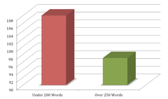
The 3D effect obscures what the precise values are. The truncated y-axis (min value = 90) exaggerates the difference between the two values. And there’s little need to visualize two values anyway.
Better: a bar chart with a zero-based axis and no 3D effects, or no chart at all.
Is it intuitive?
Intuitive charts have visual elements that immediately match the main message by making use of established conventions or primary visual metaphors.
The example below from the World Bank has a lot going for it, but there’s dissonance between the title’s message of growth and the primary visual of flat lines. We expect to see something going up. By bucking some fundamental conventions and primary visual metaphors (e.g., that size is usually represented vertically and time horizontally), the chart requires additional effort to understand.
Rule-breaker #2, from the World Bank:
Flat lines not intuitive for notion of growth. We expect time to be along the horizontal axis. The colors selected for the years are also counterintuitive. The movement in time from dark dots to light dots also bucks expectations. Light to dark would be more intuitive.
Better: A line chart or slope graph are good candidates. With the emphasis being the difference between two endpoints and not all the values in between, a slope graph would be best.
Is it memorable?
To be intuitive, we use conventions. To be accurate (and nothing but accurate), we strip out the superfluous. But it turns out that visualizations with more “chart junk” (like illustrations and other nondata elements) are more memorable.
It makes sense that unusual elements would make a chart more memorable, but how can you embrace being memorable without compromising the other aspects of effective data visualization?
I wouldn’t reach too quickly for the clip art or brazen illustrations. Consider instead using small icons to help illustrate your data and, at the very least, make sure your charts are consistent with your brand’s style so that people are more likely to remember where they saw it. The chart below would benefit from both.
Rule-breaker #3, from the Peterson Institute for International Economics:

Default fonts. Minimal branding. Not memorable.
Better: Small icons for highway, railway, and air transport would help make this chart more memorable, and identify the lines more quickly than the legend. Brand colors are present, but brand-appropriate typeface and a logo would help it linger in the mind longer.
Is it self-contained?
Self-contained data visualizations convey their main messages quickly even when they’re separated from their original contexts. This is good for two reasons: first, many of your readers are only scanning what you write and won’t get much from charts and graphics that don’t quickly convey messages on their own. That’s a missed opportunity to get your point across.
Second, self-contained data visualizations are ready for posting on social media or as standalone content on your website. From one blog with three charts, for example, you get four pieces of content with no additional work.
How to make a chart self-contained depends on the information being conveyed, but the cardinal rule is this:
The chart’s title should be a statement of the main message.
If you can build the chart to the dimensions used by various social media (roughly 2:1 for Facebook, Twitter, and LinkedIn), even better—it’ll look great on your website and in my Twitter feed.
Rule-breaker #4, from Resources for the Future:

Good dimensions for social media, but not self contained.
Without the context we lose sight of what the chart is about (spent oil wells) and the main points: that while Alaska’s and North Dakota’s regulations are more stringent that the Bureau of Land Management’s, “no state is regulating all five elements [of ensuring the safety of spent oil wells] the most stringent way.”
Better: A new title—“Two states outperform the Bureau of Land Management but regulation of spent oil wells is poor overall," or something similar. With that, the chart would communication much more quickly and be able to stand on its own on social media and elsewhere.