
Mapping data from the National Flood Insurance Program
Published | Project
The National Flood Insurance Program offers insurance policies for homeowners living within 100-year floodplains. The program has been operating on short-term extensions and is due for reauthorization in July 2018. Knowing how homeowners value insurance and what encourages them to buy more or less of it should be one of the factors informing how the program continues. That question is the subject of research by Andrew Royal at Resources for the Future; this map visualizes some of his findings, showing large-scale geographic and demographic patterns.
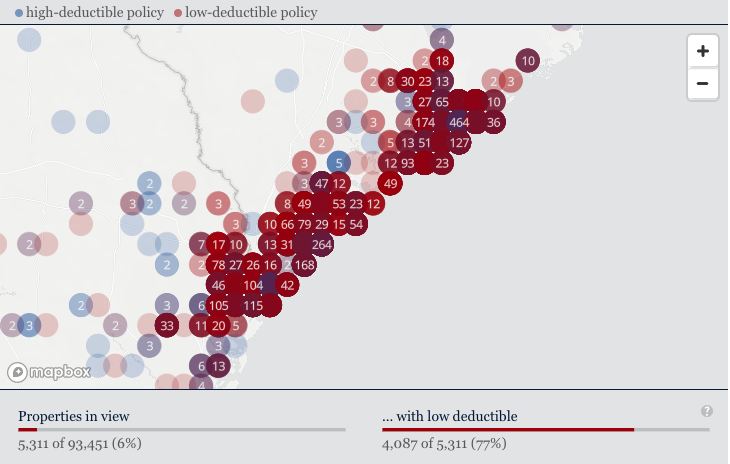
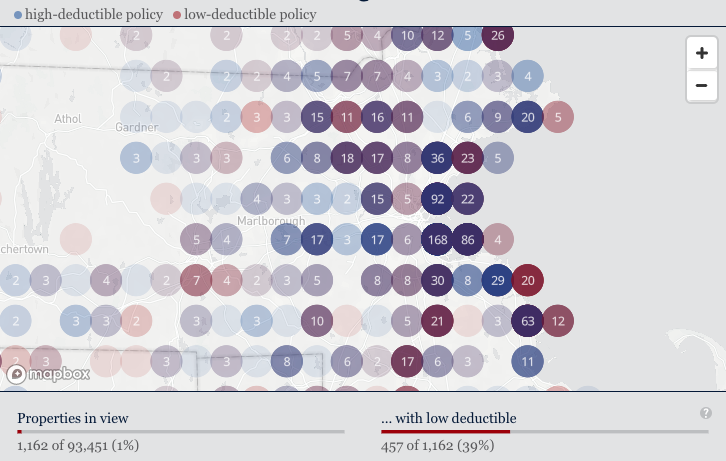
The research centers on homeowners’ decisions whether or not to pay more for a policy with a lower deductible. You can see in the map that low-deductible policies (in red) seem to predominate in the Southeast, especially on the coast, while high-deductible policies seem to cluster in major metropolitan areas. Zooming in to the coastline in southern South Carolina and northern Georgia, for instance, reveals that nearly 80 percent of policyholders chose to lower their deductible while only 40 percent of those in the Boston area chose to do so.
The research shows that wealth has a lot to do with decisions around deductibles. Some economic theory holds that the richer you are, the less likely you are to buy insurance because you’re better able to independently hedge against financial risk. The research on this sample of policyholders, however, shows the opposite: wealthier homeowners are more likely to opt for more expensive policies with lower deductibles. You can see some of that pattern show by zooming and panning around on the map. The median household income (census-tract data) and reported home values tend to increase as the saturation of low-deductible policies increases. The charts show other variables as well as the position of the map changes: average premium, average coverage amounts, and average marginal cost for lower deductibles.
Some technical notes
The map plots 93,541 policies with geographical precision down only to the census tract for anonymizing purposes. It is a MapBox GL JS application with three added data layers: the individual red and blue points plotting location and density, red and blue circles as you zoom in plotting location, density, and the cost of the premiums, and a clustering layer, also as you zoom in, which shows how many policies occupy the same spot—in this case the same census tract.
The charts adjust as the map is adjusted so that data only from within the bounds of the map’s current position is factored in. Several of the charts are plotted according to z-score, or the number of standard deviations from the mean. This way, average is midway across the chart and individual charts are roughly comparable with each other. A longer bar always means a higher value, relative to the others in the same set.